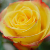
| You may have caught on by now that Photoshop has “opposite” blend modes: Darken vs. Lighten, Multiply vs. Screen, and Color or Linear Burn vs. Color or Linear Dodge. So the definition in Photoshop Help for Color Dodge may sound eerily familiar: Color Dodge: Looks at the color information in each channel and brightens the base color to reflect the blend color by decreasing the contrast. Blending with black produces no change. Similar to Screen, Color Dodge will always result in a lighter image—except the contrast will be turned waaaay up. Here’s what it looks like: I’ll start with my standard rose picture:
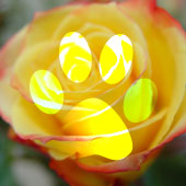
Then I’ll add my semi-standard pawprint layer and set it to Color Dodge:
The pure black area of the pawprint layer results in no change, but all other areas dramatically lighten the image underneath.
|
Friday, 12 June 2009
Color Dodge Blend Mode

Vivid Light Blending Mode
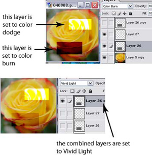
| Photoshop’s describes Vivid Light blending mode as combining the effects of Color Dodge and Color Burn modes like this: Vivid Light: Burns or dodges the colors by increasing or decreasing the contrast, depending on the blend color. If the blend color (light source) is lighter than 50% gray, the image is lightened by decreasing the contrast. If the blend color is darker than 50% gray, the image is darkened by increasing the contrast. In reality, however, Vivid Light brightens images similar to Color Dodge mode, but doesn’t darken quite as much as Color Burn. In this diagram below, I created two layers, one with a light grey box, one with a dark grey box, and set the former to Color Dodge and the latter to Color Burn. You can see that the Color Dodge layer lightens the image dramatically and the Color Burn layer darkens the image dramatically. But in the second sample, I took the two boxes, put them on the same layer, and set it to Vivid Light. The light box does result in a lighter image comparable to Color Dodge, but the dark box has significantly less contrast as compared to Color Burn. The thing to remember from all of this is that Vivid Light mode will take the blend layer and make the lighter areas a lot brighter than it will make the dark areas darker.
For my practical application, I’ll use Vivid Light mode to overlay text on top of other images. Because Vivid Light doesn’t really “show” the blend layer, but just uses the blend layer to affect the colors of the base layer, the text will look more like it’s “part” of the picture, as opposed to being a slightly transparent layer on top of a picture. |
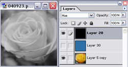
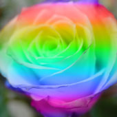
Hue Blending Mode in Photoshop
| The Hue Blend mode is pretty straightforward: Hue Mode: Creates a result color with the luminance and saturation of the base color and the hue of the blend color. So essentially, the top blend layer, set to Hue, will “color” the layers below with whatever color you put on the blend layer, and adjust the color to take on the brightness and saturation of the layers beneath. For example, let’s start with my standard rose image:
I’ll put a solid blue layer over it and set it to “Hue” mode. The rose layer will be “colorized”—kind of—with the blue (but note that the areas around the rose have a bit more grey than blue in them because it adjusts the saturation of the color as well).
So, here’s yet another way to turn a color image into black and white: Add a black—or white—layer and set it to “Hue” mode:
Setting a new, blank layer to “Hue” means that you can “paint over” any part of your image and change the color. As a kind of extreme example, I made a selection of just the rose and then filled it with a rainbow gradient.
And here’s what the result looks like:
|


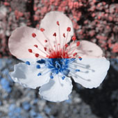
Saturation Blend Mode in Photoshop
We’re in the home stretch of the Photoshop Blending Modes series (good heavens, that means I have to come up with more topics to write about!), and today’s blog looks at the Saturation Blend Mode. Recall how the Hue blending mode kept everything the same on the base layers, but applied the hue (color) from the blend layer. Saturation mode is similar, where everything stays the same on the base layer, except the saturation from the blend layer is applied. Try this example on for size: Start with my cherry blossom picture —
Add this blend layer, which has a highly-saturated blue and a not-very-saturated blue:
Setting the blend layer to Saturation mode produces this effect:
As expected, the top half (the light, not-very-saturated blue) results in a less-saturated flower image, while the bottom half is very saturated. Now for a practical application. I’ll start with my standard rose image and then add a radial gradient to produce this blend layer, using a not-very-saturated color:
(To do this, I had to open the Gradient Editor by clicking on the gradient preview in the top toolbar, and make a new gradient from the foreground-to-transparent gradient, then flip the sliders that defined the gradients to make a transparent-to-foreground gradient.)
Combining the radial gradient blend layer (set to Saturation mode) results in this image:
It kind of reminds me of a “breathing life into something” kind of image, maybe representing some kind of “inner life” or “inner glow.” I’m sure you can find your own use for this technique… |


Color Blend Mode in Photoshop
As an example, here’s a layer that is half red, half blue:

Set to Color Mode and placed over another image, you get this:

Color Mode is pretty close to Hue Mode, so let’s look at Hue Mode again to get rid of any confusion. Hue Mode keeps the brightness and satuation of the base color but applies the hue of the blend layer. Color Mode keeps the brightness of the base color and applies both the hue and saturation of the blend color.
So here’s how the scenario changes when the blue/red layer is set to Hue Mode instead:
As you can see, there’s more “grey” in this picture; the blue and reds are desaturated in the areas where the original image didn’t have much saturation.
Does that make more sense?
And following Photoshop’s practical application advice, here is a sepia-toned cherry blossom:

Photoshop’s Luminosity Mode
| Photoshop says this about the Luminosity Mode: Creates a result color with the hue and saturation of the base color and the luminance of the blend color. This mode creates an inverse effect from that of the Color mode. Just to prove the point, I’ll take a cherry blossom layer, duplicate it, and desaturate one of the layers.
I’ll set both layers to “Luminosity Mode” and put them one at a time over a rose layer. Both get the exact same result:
The grey levels of the blend layer (cherry blossom) are applied to the colors of the base layer (rose). As a kind-of practical application, I’ll start with the rose layer and apply a Curves adjustment layer by clicking on the adjustment layer icon in the bottom of the Layers Palette and then choosing “Curves”:
I click twice on the line and drag and adjust the curves like this:
As you can see, this makes the picture a bit “darker” or saturated. The yellow is really bright; the darker areas of the image have been made even darker. Now, I set the mode of the Curves layer to “Luminosity.”
This keeps the colors of the original picture but keeps the contrast from the curves adjustment layer and gives the image an almost old-photo-ish kind of effect. |


Copying Layer Styles in Photoshop
I just learned a new trick!!
I’ll explain my “old way” of doing things first.
Let’s say you have a layer in Photoshop and apply a Layer Style (drop shadow, stroke, bevel, etc…). The Layers palette shows which effects you’ve applied (see picture below). Quite often, I find myself needing to duplicate layer effects on other layers.

Now in the “old days,” I would right-click on the layer and choose “Copy Layer Style,” then right-click on the target layer and choose “Paste Layer Style.”

But those days are gone.
Now, I know that I can simply click on the “Effects” text, drag, and drop it on my target layer (actually, slightly “below” the layer—you’ll see what I mean when you try it)—and the effect will be applied immediately!

I am always ecstatic when I find ways to do things that involve less clicking.
By the way, you can also click-and-drag the individual effects to copy them as well. You just click the “Effects” text if you want to apply the whole lot of them.
Photoshop Tool Basics
I decided to start at the beginning. The very beginning. For those people who just "picked up" a copy of Photoshop and have no idea what to do with it. The keyboard shortcut is in ( ). Rectangular Marquee Tool (M) Use this tool to make selections on your image, in a rectangular shape. This changes the area of your image that is affected by other tools or actions to be within the defined shape. Holding the Shift key while dragging your selection, restricts the shape to a perfect square. Holding the Alt key while dragging sets the center of the rectangle to where your cursor started.  Move Tool (V) Use this tool to, well, move things. Usually you use it to move a Layer around after it has been placed. Hold the Shift key to limit the movements to vertical/horizontal.  Polygon Lasso Tool (L) Ok, this should be the Lasso Tool, but I use the Polygon Lasso a lot more often. Use this to draw selections in whatever shape you would like. To close the selection, either click on the beginning point (you'll see the cursor change when you're on it), or just double-click. When holding the Ctrl key, you'll see the cursor change, and the next time you click, it will close your selection.  Magic Wand Tool (W) Use this to select a color range. It will select the block of color, or transparency, based on wherever you click. In the Options Bar at the top, you can change the Tolerance to make your selections more/less precise.  Crop Tool (C) The Crop Tool works similarly to the Rectangular Marquee tool (see above if you have no short-term memory). The difference is when you press theEnter/Return key, it crops your image to the size of the box. Any information that was on the outside of the box is now gone. Not permanently, you can still undo.  Slice Tool (K) This is used mostly for building websites, or splitting up one image into smaller ones when saving out. It's kind of an advanced tool, and since you're in here for the basics, we'll kind of skip over it. Kinda makes you mad I made you read all that for nothing, huh?  Healing Brush Tool (J) This is a really useful tool. Mildly advanced. You can use this tool to repair scratches and specs and stuff like that on images. It works like the Brush tool (see below). You choose your cursor size, then holding the Alt key, you select a nice/clean area of your image. Let go of the Alt key and paint over the bad area. It basically copies the info from the first area to the second, in the form of the Brush tool. Only, at the end, it averages the information, so it blends.  Brush Tool (B) This is one of the first tools ever. It's what Photoshop is based off of. Well, not really, but it's pretty basic. It paints one your image, in whatever color you have selected, and whatever size you have selected. There's a lot of options for it, but this is basic, so you don't get to learn them. Ha.  Clone Stamp Tool (S) This is very similar to the Healing Brush Tool (see above). You use it the exact same way, except this tool doesn't blend at the end. It's a direct copy of the information from the first selected area to the second. When you learn to use both of these tools together in perfect harmony, you will be a Photoshop MASTA! Not really, it's just less irritating.  History Brush Tool (H) This tool works just like the Brush Tool (see above) except the information that it paints with is from the original state of your image. If you go Window>History, you can see the History Palette. The History Brush tool paints with the information from whatever History state is selected.  Eraser Tool (E) This is the anti-Brush tool. It works like an eraser (duh) and erases whatever information wherever you click and drag it. If you're on a Layer, it will erase the information transparent. If you are on the background layer, it erases with whatever secondary color you have selected.  Gradient Tool (G) You can use this to make a gradiation of colors. Gradiation doesn't appear to be a word, but it makes sense anyway. It creates a blending of your foreground color and background color when you click and drag it. Like a gradient.  Blur Tool (R) The Blur tool is cool. It makes things blurry. Click and drag to make things blurry. The more you click and drag, the blurrier things get.  Dodge Tool (O) This tool isn't as crappy as the car brand. It's actually used to lighten whatever area you use it on. As long as it is not absolute black. Absolute black won't lighten.  Path Selection Tool (A) You use this tool when working with paths. Since this is all about the basics, I won't go into details. It's related to the Pen Tool (see below) though.  Horizontal Type Tool (T) It makes type. Or text. Or whatever you want to call it. You can click a single point, and start typing right away. Or you can click and drag to make a bounding box of where your text/type goes. There's a lot of options for the Type Tool. Just play around, it's fairly straight-forward.  Pen Tool (P) I mentioned this tool above. It's for creating paths, in which you would use the Path Selection Tool to select the path. Paths can be used in a few different ways, mostly to create clipping paths, or to create selections. You use the tool by clicking to add a point. If you click and drag, it will change the shape of your path, allowing you to bend and shape the path for accurate selections and such.  Rectangle Tool (U) By default it draws a Shape Layer in the form of a rectangle. It fills the rectangle with whatever foreground color you have selected. It's pretty complicated, don't hurt yourself with this one.  Notes Tool (N) Like post-it notes, but digital. You can use this tool to add small little note boxes to your image. These are useful if you're very forgetful or if you're sharing your Photoshop file with someone else. I'm pretty sure it only works with .PSD files.  Eyedropper Tool (I) This tool works by changing your foreground color to whatever color you click on. Holding the Alt key will change your background color.  Hand Tool (T) You can really make short work of your job with the Hand Tool. It's for moving your entire image within a window. So if you're zoomed in and your image area is larger than the window, you can use the Hand Tool to navigate around your image. Just click and drag. You can get to this tool at any time when using any other tool by pressing and holding the Spacebar.  Zoom Tool (Z) Pretty obvious what this tool does. It allows you to zoom into your image. Don't be dumb, it doesn't actually change the size of your image. Hold theAlt key to zoom out. Holding the Shift key will zoom all of the windows you have open at the same time. Double-click on the Zoom Tool in the palette to go back to 100% view.  These are your color boxes. Foreground (in the front) and Background (in the back). Click on either one to bring up the color select dialog box. |